
Why AI-Generated Artwork Prints Muddy on Mylar Bags (And How to Design Around It)
Share
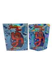
Something is happening across the whole custom packaging industry right now, and if you have designed a bag in the last few months you have probably run into it. A customer generates artwork in ChatGPT, Midjourney, or another AI image tool. On their phone it looks unreal — glowing colors, insane detail, photo-level realism. They send it in, we print it, and the bag comes back looking flat and muddy. The detail turns to mush. The colors go dull. It looks nothing like the screen.
Then the same thing happens when they try another printer. And another. Eventually they realize it is not one shop cutting corners — it is every printer. That is the important part, so let us start there: this is not a Fire Mylar limitation, and it is not your printer's fault either. It is a limitation of print itself, and every printer on earth hits the same wall. Once you understand why, it is easy to design around.
First, let us kill the myth: it is not because the image is “too high resolution”
A lot of people assume the muddiness comes from the image being too big or too detailed — that a 4K, 6K, or 8K file is somehow “too much” for the printer. That is not what is going on.
Print resolution is measured in DPI (dots per inch), and quality print runs at about 300 DPI. A standard mylar bag print area is small — call it 4×5 inches. At 300 DPI, that only needs roughly 1,200 × 1,500 pixels to look perfectly sharp. A 4K image is already far past that. A 6K or 8K file is way past it. When you feed a printer more pixels than it can physically lay down, it simply uses what it can resolve and discards the rest. Extra resolution does not muddy the print — it just gets ignored.
So more pixels is not the villain. The real issue is what those AI images are made of.
The real reason: a glowing screen and a printed bag are two different worlds
Your phone is a light source. The screen is backlit, it displays color in RGB, and it can show an enormous range from deep shadow to blazing highlight. That is why AI art looks so good on it — the images are built to be lit from behind, with soft gradients, subtle low-contrast detail, and a photographic glow.
A printed bag is the opposite. It is ink sitting on reflective film. It shows color in CMYK, its range from dark to light is much narrower, and it only looks as good as the light bouncing off it. When you take an image designed to glow and press it into ink on a small piece of film, a few things happen at once:
- The contrast collapses. Print cannot reproduce the dynamic range of a backlit screen, so subtle shadows and glowing highlights flatten into the same muddy middle.
- Fine detail smears. Delicate texture that reads beautifully on a 6-inch screen has nowhere to go when it is shrunk onto a bag, and ink naturally spreads a little on film, blurring it further.
- Colors dull down. The vivid, saturated tones a screen can throw simply do not exist in the CMYK ink range, so they shift and desaturate.
Here is the part that explains exactly what you have been noticing lately. Newer, higher-end AI models pack in more of the stuff that print struggles with — more photographic subtlety, more soft gradients, more fine micro-detail, more glow. So they look even more jaw-dropping on a screen… and lose even more when they hit ink. That is why the pattern feels like “the better the AI gets, the worse it prints.” It is not the pixel count climbing. It is the character of the image getting more screen-native and less print-friendly.
Why high-contrast designs are quietly winning again
This is also why customers are drifting back to bold, high-contrast artwork — and why it works. Strong contrast, clean shapes, thick linework, and a limited, punchy color palette all survive the trip into ink. There is no subtle gradient to lose, no delicate glow to flatten. What you see on screen is close to what you get on the bag, because the design was never leaning on things print cannot do.
The old-school “loud logo, hard edges, two or three bold colors” look was not just a style choice. It was built for print, which is exactly why it still reproduces cleanly today.
How to design AI artwork that actually prints sharp
You do not have to abandon AI tools — they are fantastic for generating concepts. You just have to translate the concept into something built for ink. A few practical moves:
- Push the contrast up. Take the AI output into any editor and increase contrast until the shapes read clearly. If it looks slightly “too much” on your screen, it is probably about right for print.
- Simplify. Bold shapes and clear focal points beat busy, hyper-detailed scenes every time on a small bag.
- Lean on line and shape, not soft gradients. Gradients and glow are the first things to muddy. Crisp edges and solid fills hold up.
- Check it at actual size. Zoom your artwork down to 4×5 inches on screen and look at it from a couple feet away. That is far closer to how it will really print than a full-screen preview.
- Use punchy, separated colors. Give the ink strong, distinct tones to work with instead of dozens of near-identical shades.
- Ask for a proof. When in doubt, get a printed proof before committing to a full run. A screen will always flatter the file.
The bottom line
AI has raised the ceiling on what artwork looks like on a screen, and that ceiling is now far above what any printer — ours, or the best in the world — can reproduce on a physical bag. That gap is not a defect in your printer or ours. It is the difference between light on glass and ink on film, and it applies everywhere.
The brands getting clean, striking bags right now are the ones designing for print first: bold, high-contrast, and simple enough to survive the ink. Use AI for the idea, then build it for the bag. Do that, and what you approve on screen is what shows up on the shelf.
Not sure whether your artwork will hold up in print? Send it over before you order — we will tell you straight whether it will reproduce cleanly or muddy out, and what to adjust.